4 柱状图的边框
题目4: 下图来自Economisit:

请问,如何在柱状图里指定的某些柱子上显示边框?
N 版
df.o <- df[order(df[,1]), ]
df.o$bd <- "NA"
df.o$bd[cl_red] <- "red"
par(mar = c(12, 4, 1, 1), las = 1)
barplot_car <-
  barplot(df.o$mpg, border = df.o$bd,
          col = df.o$cyl, ylab = 'mpg',
          main = 'Miles per gallon')
legend('topleft', legend = unique(df.o$cyl),
       fill = unique(df.o$cyl), title = 'cyl',
       border = NA, bty = 'n')
text(x = barplot_car[cl_red],
     y = df.o$mpg[cl_red],
     labels = df.o$hp[cl_red])
mtext('car', 1, 8)
axis(1, at = barplot_car, labels = df.o$car,
     las = 2)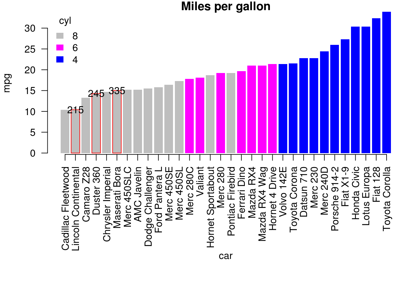
T 版
require(ggplot2)
require(dplyr)
df.sort = df %>%
  arrange(mpg)
df.sort %>%
  ggplot(aes(x=car,y=mpg,fill=cyl))+
  geom_col()+
  geom_col(data= df.sort[cl_red,],
           color="red", size=1)+
  geom_text(data= df.sort[cl_red,],
            aes(label=hp))+
  scale_x_discrete(limits= df.sort$car) +
  theme_classic()+
  theme(axis.text.x =
          element_text(angle = 90, hjust = 1))+
  ggtitle("Miles per gallon")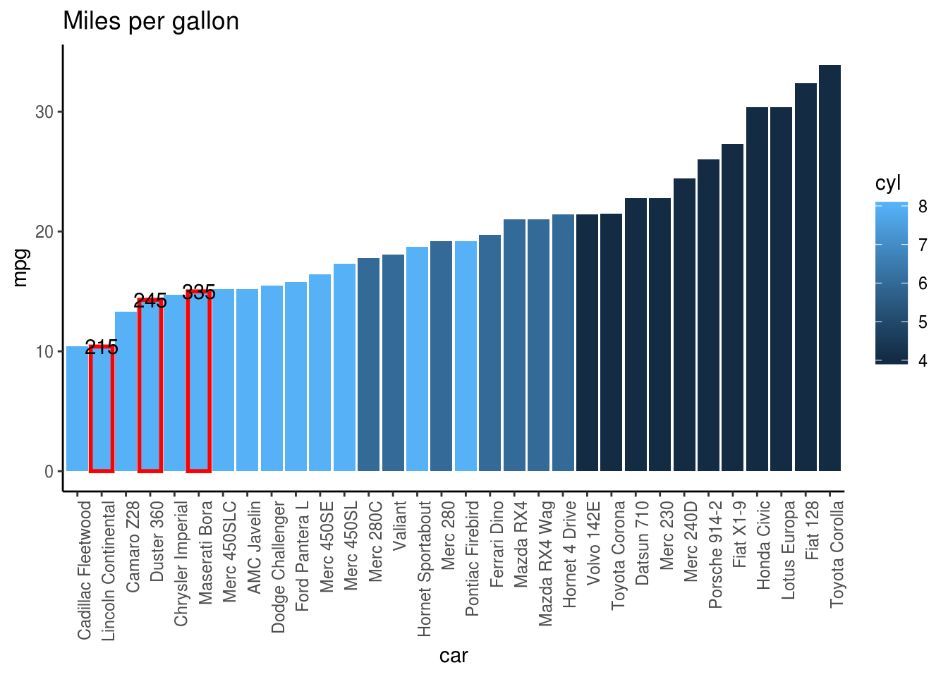
贡献者为 @seeyou14 @tctcab @Liechi 等,来自 https://d.cosx.org/d/421117。↩